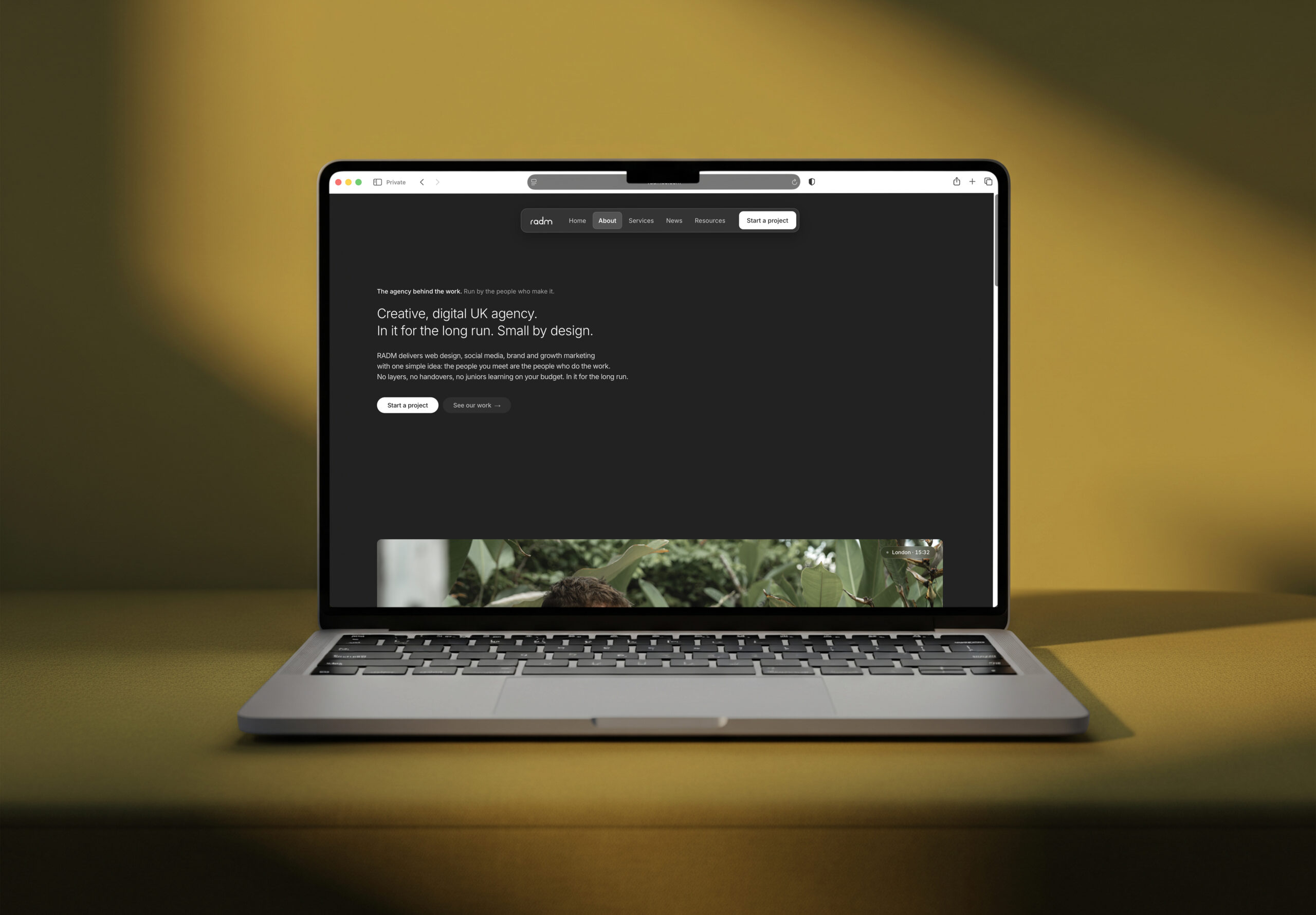
Every agency website says the same three things: we are creative, we are strategic, we are partners. Ours used to say them too. The new one tries to do something harder, which is to show you how we work before you have spoken to us.
The old site listed. This one proves.
The site we replaced did what most agency sites do. It listed services, it looked tidy, and it told you nothing you could check. That sounds harmless until you notice what it attracted: enquiries asking for a price on a page count, rather than a plan for a problem.
So the brief for the rebuild was narrow. Every section had to earn its place by answering a question a real client had actually asked us, in the words they used to ask it. If a module existed only to look considered, it went. That rule alone removed about a third of what we had planned.
One system, not four sub brands
Four disciplines run through the site: web design and build, social media, brand and creative and growth marketing. The easy route would have been four looks, one per service, each with its own colour and personality.
We built one instead. Same type scale, same spacing, same easing on every animation, across every page. That is a decision about the work as much as the design: one team is accountable for the whole journey, and it would be strange for the site to pretend otherwise.
- A single type scale, so a heading on the brand page is the same size as a heading on the growth page
- One motion curve everywhere, so the site moves like one object rather than eleven components
- Modules that recur in the same order, so the second service page you read is faster than the first
Monochrome on purpose
The whole site is black, white and a warm off white. No brand colour, no accent, no gradient. That was the most argued over decision in the build, and the reasoning is simple: the only colour on screen should be the client work.
Restraint also has a practical payoff. When you cannot reach for colour to make something feel important, you have to earn the emphasis with hierarchy, spacing and weight. It makes the writing work harder, and the writing is where an agency site actually persuades.
If we cannot prove it, we do not claim it. Where we had a verified number, we used it. Where we did not, we left the space empty.
Proof before pitch
On every service page, the proof section sits before the sales copy rather than after it. That ordering is deliberate and it is harder to maintain, because it means having something true to show on the day you publish.
It also meant leaving gaps. On one page there is a client quote with no statistics next to it, because the numbers were not verified yet. An empty space is a strange thing to defend in a design review, and it is the part of the site we would most like other agencies to copy. Our work is the longer version of the same principle.
The wordmark
The mark is the word radm, drawn as a single continuous stroke weight. It sits at the same weight as the interface around it rather than shouting above it, which suits a business where the work is meant to be more visible than the logo on it.
What this means for your site
Nothing here is exclusive to us. The order of the sections, the proof before the pitch, the refusal to invent statistics: all of it transfers, and most of it costs nothing except the discipline to do it.
The part that does not transfer for free is the system underneath. Building the rules first and the pages second is slower for a fortnight and faster for years, because every new page after that is writing rather than rebuilding. It is the same reason a brand system beats a logo, and the same reason we would rather agree how your site works before we agree what it looks like.
If your site is doing the listing thing rather than the proving thing, that is usually a short conversation and a plan. Tell us what you are building and we will show you what it could be.